
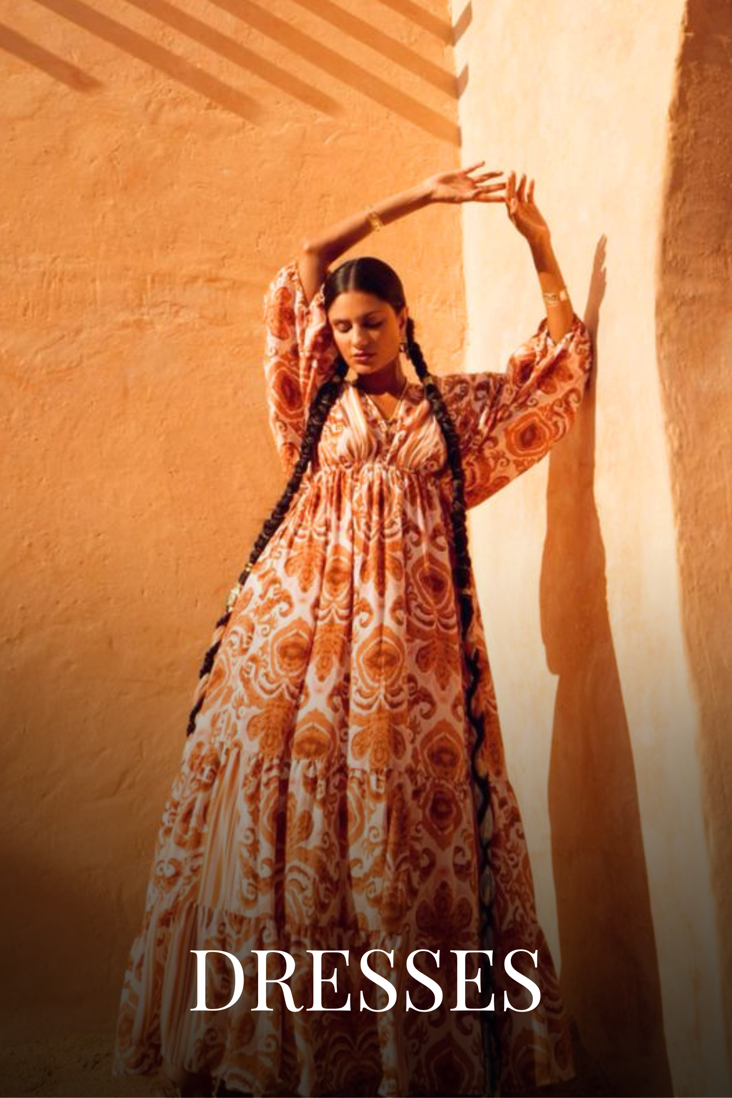
03 Nov What Makes a Fashion Website Feel Premium?
Proins gravida nibh vel velit auctor aliquet. Aenean sollicitudin, lorem quis bibendum auctor, nisi elit de conse qu atip sum, nec sagittis dolor sit amet, consectetur adipis eng elit. In ut ulla corper leo, eget eui et orci. Cum et sociis natoques penatibu et magnis parturie montes, nascetur ridicu lus mus. Vestibu ni ultricies aliquam de convallis. Des ece nas utimsems tellus proin tinci de lect.
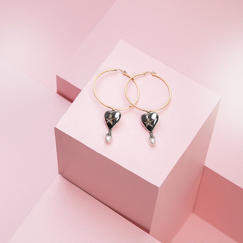
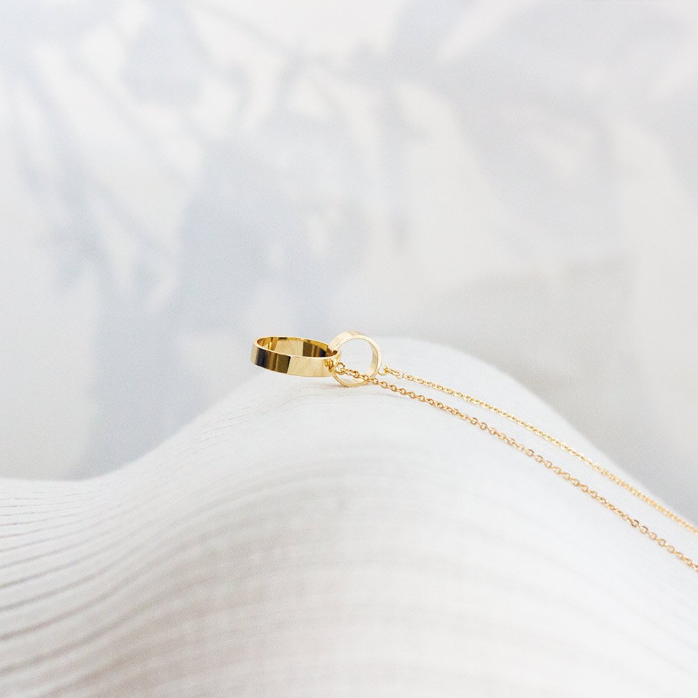
From thoughtful typography to beautiful product pages, discover the design details that shape your brand’s online experience and help customers shop with confidence.
A fashion website is often a customer’s first introduction to your brand. Before they touch the fabric or try on a garment, they experience your photography, your words, and the way your store feels.
A premium experience comes from thoughtful decisions throughout that journey. The website should express your brand’s personality while making every step—from discovering a collection to choosing a size—feel clear and effortless.
1. A Distinctive Visual Identity
Your website should feel like a natural extension of your clothing.
An occasionwear label might use expressive serif headings, rich colours, and immersive campaign imagery. A contemporary everyday brand might suit clean typography, fresh colours, and a more relaxed layout.
Choose a focused colour palette, a consistent type system, and a recognisable photography style. Carry these choices across your homepage, collection pages, product pages, and cart.
Premium design can be colourful, understated, traditional, or modern. What matters is that it feels intentional and true to the brand.
2. Photography That Shows the Details
Fashion photography needs to communicate both desire and practical information.
Campaign images establish the mood. Product photographs help shoppers understand what they will receive. Include front and back views, close-ups of embroidery or fabric, and images that show how a garment falls on the body.
For an ethnic wear label, a close-up of the weave or handwork can make craftsmanship visible. For everyday clothing, natural movement can help communicate comfort and fit.
Consistent lighting and image proportions also make collection pages feel considered.
3. Typography and Space That Guide the Eye
Typography sets the tone, but it also needs to make information easy to read.
Use expressive headings alongside clear body text. Keep product descriptions, prices, and size information comfortable to read on smaller screens.
Give images and text enough breathing room. When every section competes for attention, shoppers have to work harder to understand the page. A clear visual hierarchy helps them notice the collection, explore the products, and find the next step.
4. A Homepage With a Clear Journey
Your homepage should introduce the brand and guide visitors towards relevant products.
Start with a strong campaign image, a concise headline, and a clear call to action. Follow with useful sections such as new arrivals, signature collections, bestsellers, or shopping by occasion.
A short craftsmanship story or founder’s note can add depth. Each section should have a purpose, whether it helps someone discover a product or understand the brand.
5. Product Pages That Answer Questions
A beautiful product page should also support a confident purchase.
Explain the fabric, fit, lining, care instructions, and what is included. Place the size guide near the size selector, and make delivery and exchange information easy to find.
Replace vague descriptions with concrete details. “Cotton kurta with a relaxed fit and side pockets” tells customers more than “a perfect addition to your wardrobe.”

No Comments